Dampai.it
FREE SHIPPING for orders in Italy over 85 €, excluding remote areas

DAMPAÌ colors

DAMPAÌ colors

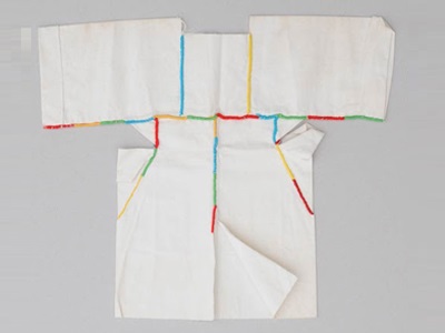
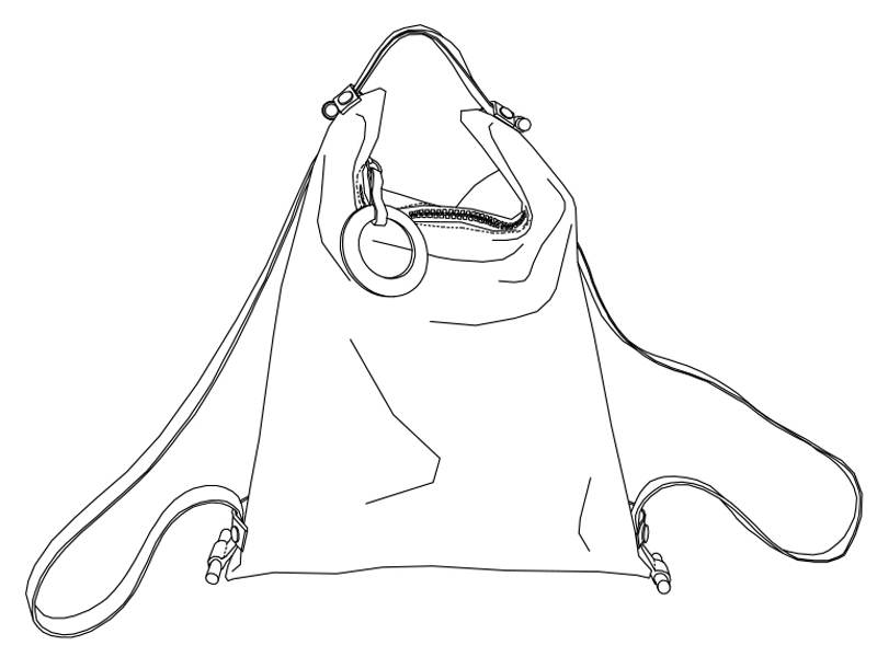
DAMPAÌ is color, it’s design, it’s play, it’s emotion …

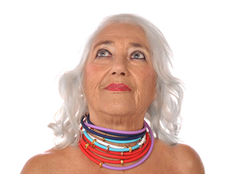
Colors vibrate and transform us ……

giallo-colori-dampaì

I am in YELLOW when I direct my thoughts into the world; I feel YELLOW when I take an initiative, when I start organizing a project, when I move willingly towards something.

BLUE are summer nights. BLUE is deep meditation. BLUE is the voice of the song, the soul that manifests itself. I feel BLUE when my ideas become abstract. BLUE is the highest mentality, the ability to see, the intuition. Creativity is BLUE.

I thought ORANGE when I reached the awareness of being female, of my sexuality, of my right to express myself. Here, ORANGE is a profound self-appropriation, the song of life, and of my individuality.

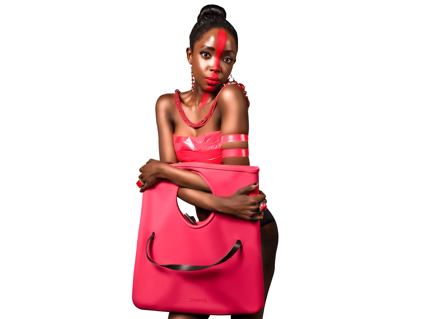
RED is the fiery sunset; it is birth, it is life, it is the passion that rises in my heart, it is the happiness of rolling around on lawns. RED like victory, RED like your lips, like revenge, like blood.

The BLACK METAL of obsidian or metallic hematite is the renewal of vital energies, their transformation into new life. From BLACK METAL I feel absorbed, protected, and I reflect; I meditate and become impenetrable–I become mystery.

BLACK is the color of introversion, the gaze that turns inward and leaves the world in search of the inner sun. With BLACK I put up a glamorous barrier.

BROWN makes me practical, reserved and humble. BROWN protects me from the world. BROWN is the color of the earth and gives me stability; it gives me my roots, it gives me the idea of the center.

GREEN gives me peace, takes care of me, cleans me, unites me with others. GREEN is deep peace, it is growth. GREEN encourages and supports. GREEN is a harmonious belonging to a community, to a group of friends.

SILVER is the color sacred to the Moon and to the lunar, feminine deities, and protects me from malevolent energies. It is the reflection of the moonlight. SILVER is when I am versatile, available; when I speak with pleasure and move quickly. I feel silver while journeying.

Opposite that is GOLD, and the Sun; it is the masculine principle, the manifest light. GOLD is healing, it is preciousness. It is nobility of spirit; it is a symbol of royalty, the divine investiture of temporal power, the highest spirituality, the highest perfection.

PEARL is the color of the moon’s rays. It takes us back to the archaically feminine; to the tides, emotions, the unconscious, the inner journey, fertility and self-esteem. The color of PEARL protects me on sea trips and accompanies me on my inner journey towards my psyche. When I wear a PEARL I stabilize my emotions, my moodiness and I harmonize with the true essence of things.

COPPER is the color that has always been linked to Venus, the goddess of love; it is virtue, it is generosity, it is vice, it is lust. It brings back to the spiritual experience the vision of beauty triumphant.

PURPLE is the color of amethyst; it is the highest plane. PURPLE is the idea of God, the peace that comes from fusion with the whole, the experience of communion, the eternal mind, the conscience that has a sense of its own eternity. PURPLE is devotion, it is spirituality. PURPLE is the thought that sees the hidden causes and knows how to forgive everything. I am very much in PURPLE when I cannot hold a grudge, when I do not feel the seed of revenge and everything seems distant, past and useless.

GRAY is neutrality, humility, boundaries, confidentiality. GRAY is the color of the distance between you and me.

Text by Angela Galli

Graphics by Andrea Lunghi

The Anatomy of Color: PANTONE COLOR’S Story

The Anatomy of Color: PANTONE COLOR'S Story

Pantone” is a bizarre word, a funny mystery, almost nonsense. It is also a particular type of marker pen and a Brussels hotel with a décor in the rainbow palette. But above all, it is a system developed in the 1950s to classify the colors and translate those printed in CMYK (cyan, magenta, yellow and black) simply thanks to a code. And since the Dampaì motto is about color, and the chromatic variations of our collections are the result of an emotional and courageous choice at the same time, the universe of color is particularly close to our hearts.

For over twenty years, the Pantone Color of the Year has guided product development and purchasing decisions in the fields of fashion; interior, graphic, and industrial design; even packaging and chef dishes. A team of experts from the Pantone Color Institute explores the virtual sphere of social media but also every corner of our earth-and-water globe to identify new trends in terms of color, ranging from the world of entertainment to fashion, from art to design, from sport to new technologies, to the most popular tourist destinations. Because Pantone is a palette of infinite shades, a multi-ethnic language, a lifestyle.

Pablo Picasso used to say: “When I no longer have blue, I wear red.” Yes, but which red?

PEACH FUZZ the color of the year 2024

VOGLIA DI TENEREZZA

Peach Fuzz 13-1023 – Pantone Color of the Year 2024 – è una delicata e avvolgente tonalità pesca che regala un abbraccio tattile riecheggiando il nostro innato desiderio di vicinanza e connessione. In un’epoca piena di tumulti, il bisogno di empatia e tenerezza cresce giorno dopo giorno, ispirando sentimenti di solidarietà e protezione. A metà strada tra il rosa e l’arancio, tra giovinezza e intramontabilità, Peach Fuzz irradia calore e sprigiona una leggerezza gentile che ci lascia immaginare un futuro più inclusivo e compassionevole.

The History of Pantone Colors of the Year

Bold yet versatile, vibrant and playful, exuberant and inclusive. Viva Magenta 18-1750, a courageous hybrid between carmine red, crimson and intense raspberry, is the Color of the Year 2023. An unconventional shade in unconventional times, it is for living the future with a rebellious spirit and renewed optimism, for meeting others with trust and empathy, humanity and compassion. Fresh out of a pandemic, facing war, an unstable economy, social unrest and growing climate change, we must heal.

A «dynamic periwinkle blue tone with a vivifying purplish red undertone that blends the fidelity and constancy of blue with the energy and excitement of red». This is Very Peri 17-3938, the “color of the year 2022” dedicated to courage, renewal, and the expression of the moment of transition we are going through. Very Peri is a promise of the change and rebirth that we would not be able to give up.

Ultimate Gray (Pantone 17-5104) and Illuminating (Pantone 13-0647) , respectively a solid and sparkling gray like the pebbles of a beach, and a vivid and warm yellow like the rays of the sun that illuminate it; the first being concrete and reassuring, while the other is soft and vibrant with hope. In a historical moment in which we wanted to come back to embracing each other, the Pantone 2021 colors are two ,

“to demonstrate that different elements come together to support each other” they write in the official statement. A combination of strength and solidarity, which conveys the desire to start over, to make up for lost time, to look at everyday life and the future with renewed energy. Because we needed to think that everything would will shine again.

The first “Pantone Color of the Year” was, in 2000, the color Cerulean Blue 15-4020. It is the color of the sky and the sea, and in the same year it was proclaimed “Color of the Millennium”.

In 2001 the tranquility of blue was forgotten and Pantone celebrated Fuchsia Rose 17-2031, a bold and captivating color, capable of attracting the female universe.

In 2002 it was True Red 19-1664, an intense and deep red shade with a strong patriotic appeal that was chosen as a result of the terrorist attacks of September 11th.

In 2003 the color of the year was Aqua Sky 14-4811, a cool blue, one of the most relaxing blue-green shades, chosen to restore hope.

In 2004 , Tigerlily 17-1456 , a warm orange that mixes points of red and yellow that evoke power and passion in one and hope in the other; two colors from which a bold and regenerating color was created.

In 2005 Pantone, following the vein of nature, selected Blue Turquoise 15-5217 , the color of the sea, a sweeter and fresher version of Turquoise.

In 2006 , it was Sand Dollar 13-1106 , a neutral shade, also with natural references, which well expressed the concerns of those years for the economic situation.

2007 was the year of Chili Pepper 19-1557 , an explosion of color that reflects the spirit of adventure and the self-confident attitude of all the individuals who at that time began to express and manifest their personality through blogs and the pages of the first social networks.

In 2008 , Pantone chose Blue Iris 18-3943, a color that satisfies the need for reassurance in an increasingly complex world, with the addition of a pinch of mystery and excitement.

2009 was the year of Mimosa Yellow 14-0848, a reassuring color, an expression of optimism and hope, fundamental in a time of economic uncertainty and political change.

The Pantone color of the year 2010 was Turquoise 15-5519 with its ability to evoke pleasant thoughts and images of tropical paradises to escape to from with the imagination from everyday problems and thus restore a sense of well-being.

Honeysuckle 18-2120, was the color of 2011: a pink shade tending to red, encouraging and stimulating, which instills confidence and courage to face the challenges of everyday life with verve and enthusiasm.

In 2012, on the wave of this energy, it was the turn of Tangerine Tango 17-1463: a lively reddish orange that combines the adrenaline rush of red with the warmth of yellow, to form a magnetic hue that emanates heat and energy.

In 2013, growth, renewal and prosperity brought Emerald Green 17-5641 to be the color of the year for its ability to convey a sense of regeneration, which is why in past centuries many countries chose this shade of green to represent healing.

In 2014 Pantone changed from green to purple and chose Radiant Orchid 18-3224, a captivating mix of fuchsia, purple and pink shades, which captures attention with its seductive charm, stimulates the imagination, inspires confidence and emanates joy, love and well-being.

In 2015 the color of the year was Marsala 18-1438, a naturally simple and robust red wine,

In 2016, Pantone chose two colors, which was a great novelty compared to previous years: Rose Quartz 13-1520 and Serenity 15-3919. The first romantic and delicate…

…the second relaxing and refined. These two colors give a feeling of balance and safety thanks to the embrace between the warmth of pink and the cold of blue.

The color of the year 2017 was Greenery TCX 15-0343, a very difficult green to wear. A color that symbolizes our desire to renew ourselves and get back in touch with nature.

2018 was the year of PANTONE Ultra Violet 18-3838 , a dramatically provocative and reflective shade of purple that communicates originality, ingenuity and visionary thinking, and shows us the way to the future.

Lively yet delicate, Living Coral 16-1546 was the color of the year 2019 , which envelops us with warmth, instilling optimism in a constantly changing world. With the invasion of digital technology and social media increasingly an integral part of our daily lives, we are looking for authentic and engaging experiences that allow us to establish personal bonds and intimacy.

. 2020 was the year of Classic Blue 19-4052 , an eternal and timeless shade of blue, elegant and simple. Recalling the sky at dusk, the reassuring qualities of this stimulating color highlight our desire for a stable base from which to start as we prepare to cross the threshold of a new era.

Text by Marco Tenucci

RED the color of love

RED the color of love

Blu è il colore della quantità.

Se racchiudi un po’ di cielo in una scatola, o se metti un po’ di oceano in un bicchiere, perderanno entrambi il loro colore.

Il blu è rimasto lassù, da qualche parte, lontano.

Quando puoi fare quello che devi fare, ti senti libero. E lo sei. Ma non hai ancora un colore. E puoi colorarti da solo.

E il rosso….rosso è il colore delle fiamme e del sangue. Finché non bruci. Perché non lo puoi sopportare. Se sei solo.

Se non sei solo.

Allora saprai che il rosso è il colore dell’amore.


Greiner & Kropilak da “L’Angelo Sterminatore” di Daniel Zezelj

Stylist & Cr. Director/Mua Thushari @donthushari www.donthushari.com

Photographer Antonio @antoniofrigeni_ph www.antoniofrigeni.com

Jewellery Designer Thusitha  @thusithasnc Sonthusitha@gmail.com

Model Barbara @barbara_keera

Democratic design

Democratic design

A DESIGNER BAG IS FOREVER

I like to think that one of my bags can be worn by anyone, following the idea of ​​”democratic design” that made IKEA great.

When DAMPAÌ was first founded in 2010, there were only big name bags with three zero prices and cheap bags on the market. The latter were ordinary, without even a touch of originality or innovation.

DAMPAÌ entered this market with the vision of selling dreams at affordable prices and transforming fashion objects into wearable design objects.

For the creation of the bags, I looked for less precious and less expensive materials such as recycled leather, felt from plastic bottles (PET), EVA plastic and later, silicone. I designed the first bag and then the following ones with exactly the same method with which, for many years, I designed “houses and things”. A DAMPAÌ bag had to be functional, with simple (almost architectural) lines, and aesthetically appealing. A DAMPAÌ bag had to be different from everything that the market was already offering.

This is how the Bernarda / Handbag line of bags came to be, simple in both design and manufacture.

The One, Two and Three bags could be completely disassembled in order to be easily transported, with savings both in shipping to our retailers and in product storage.

Today, we still have the TWO and THREE models on the market. These bags have been reviewed and revised and, due to their simplicity of manufacture, they are packaged inside the DAMPAÌ laboratory, in the Porto Azzurro prison.

I believe that any artist, stylist, or designer like me should be interested in conveying their aesthetic ideas to as many people as possible, leaving behind the elitist and now obsolete principle of “beauty for a few”, and in contrast trying to develop concepts of aesthetics and beauty that are accessible to a large number of people, in terms both of taste and cost.

Simona Giovannetti Architect

The manufacture of each DAMPAÌ fashion leather bag is Italian, and they are produced and packaged in our Tuscan laboratory; every detail of the bag and each accessory is especially produced to our design (zip pulls, logo, buttons ….), and each model is a unique design and cannot be found on the market in other bags with the same target audience.

DAMPAÌ faces

DAMPAÌ faces
prima campagna fotografica dampai

How DAMPAÌ was created

It was late 2010, which seems like a long time ago because so many things have happened since then…

I had been wanting to get closer to the world of design for a long time, and after many years of working in my architecture studio to design houses, I finally had the financial ability to follow my passion.

MYS: project of a flip-flop

For two years I had been collaborating with a group from Bologna for the production and launch into the fashion world of a rubber sandal I had designed (https://www.facebook.com/MYS-327439464004139/), but the project, despite the huge investments made, did not work out. I had proposed a name for this rubber sandal: DAMPAÌ. I chose this name during a dinner with some of my old friends, including Shole, a Persian woman, who I have known since university. DAMPAÌ is a Persian composite word meaning “within walking distance“, as well as flip-flop, and it has a broader meaning that comes close to our “within reach“: it fits easily, and is easy to wear.

The Bologna group had launched an international competition and four focus groups to find a name for my sandal and DAMPAÌ was not even taken into consideration. MYS (Make Your Style) was chosen instead, a whole different story.


blog-rima-canpgana-fotografica

Bianca

Marketing…

Two years with many words and little completed had passed; marketing was being talked about and English words were used but not much was actually done. With this experience, I then thought of doing something myself. I founded Dampaì srl (single-member company) and I designed and produced a rubber bijoux, made of a rubber tube with a metal pin. The pin entering the center of the tube allowed it to close and, depending on the length of the tube, you could create a bracelet or necklaces of various lengths. The Dampaì bijoux had been created.

Up to that point you could buy rubber bracelets or watches, but there was no real bijoux, Dampaì was the first!

blog prima campagna fotografica dampaì

Alice

blog- prima campagna fotografica

Elia

prima campagna fotografica dampai

Alessandro

blog prima campagna fotografica amalia

Amalia

blog prima campagna fotografica dampai ilio

Ilio

blog prima campagna fotografica dampai

Camilla

The first photographic campaign: DAMPAÌ faces … 

The first Dampaì photographic campaign took shape on an afternoon in December 2010, with the collaboration of my photographer friends Andrea Lunghi and Marco Barretta and with my artist friend, not to mention editor, Angela Galli.

During the Christmas holidays, we created a true photographic studio in Angela’s cellar / studio in the historic center of Capoliveri on the island of Elba, where I live, and we contacted and photographed friends, relatives, and all those who passed by in the street and who came to browse: everyone was photographed with Dampaì bijoux.


The project was created like this, with the joy and spontaneity of its participants shining through  the resultant shots.

Our photographic campaign and the bijoux were then copied by a famous Italian company, but none of those same emotions came through their shots from the idea they had stolen.

prima campagna fotografica dampai tommaso

Tommaso

prima campagna fotografica dampai roberta

Roberta

prima campagna fotografica dampai pietro

Pietro

pria campagna fotografica dampai

Pippo

prima campagna fotografica dampai lisa

Lisa

prima campgana fotografica dampai gianfranco

Gianfranco

Davide against Goliah…

In January 2011 the Dampaì bijoux arrived at the Macef fair in Milan. It did not go unnoticed and was an immediate success.

The well-known Italian jewelry brand Boccadamo srl copied Dampaì by launching “Toobe” as summer jewelry on the national market with an advertising campaign in the most popular magazines and media. It suddenly seemed that the less well-known Dampaì bijoux was the copy of the more famous brand, but Dampaì went through legal channels and won first the emergency case and then the formal complaint against Boccadamo srl, by demonstrating the imitation of both its bijoux and the advertising campaign for the product.


blog-prima-campgna-fotografica-dampai

Dario

prima campagna fotografic dampai

Fabiola

prima campgna fotografica dampai paola

Paola

prima campgna fotografica dampai lorenzo

Lorenzo

prima campagna fotografica dampai

Marta

prima campgna fotografica dampai elia

Elia

Dampaì is easy, it’s fun, it’s smart… it’s you!

Dampaì is an ornament, an accessory and a game, all at the same time, that stimulates us in the search for our rhythm. Our rhythm of colors, rhythm of shapes, rhythm of balances, rhythm of sensations that we make our own according to our perceptions and our aesthetics: thus we express our distinctive traits, our mark, and therefore we distinguish ourselves. Dampaì arouses the joy of playing in all those who approach it and manipulate it with the desire to compose, through colors and shapes, infinite combinations and patterns: monochromatic, binary and multicolored.
With contemporary design as key, Dampaì seeks a new way to personalize its accessories.

Dampaì is easy, it’s fun, it’s smart … it’s you!. Dampaì is simple though not trivial; it is a fresh way to play; it establishes a creative interaction with the wearer, and it is an object of art to be worn over and over, in many different ways.

Dampaì is easy, it’s fun, it’s smart… it’s you!

prima campagna fotografica irene

Irene

prima campagna fotografica magdala

Magdala

prima campagna fotografica dampai- federico

Federico

To Lucia Bartolini

blog lucia bartolini
lucia 1 borsa

History and biographies have always fascinated me. The sources of inspiration for my projects, whether of architecture or design, are often female figures. Their stories speak of talent, vision, new languages ​​and an almost total absence of social recognition. For some years now, I have decided to link my design directly to their memory. The names of the Dampaì design objects-to-wear are a tribute to the female personalities that I feel closest to me.

One of these is the Italian architect and designer Lucia Bartolini, from the design group Archizoom.

blog lucia foto archizoom

Archizoom, 1968. From left, Andrea Branzi, Gilberto Corretti, Paolo Deganello, Massimo Morozzi, Dario and Lucia Bartolini. Photo © Studio Branzi

To Lucia

In 1968 Lucia Morozzi Bartolini and her husband Dario joined the Archizoom group, founded in Florence in 1966 by Andrea Branzi, Gilberto Corretti, Paolo Deganello and Massimo Morozzi, who remains one of the most authoritative voices of radical architecture *.
The Archizooms embraced many areas of creativity and design, from the design of objects, to clothing, and from furniture design to large urban-scale proposals, interpreting the ideals of a generation that believes in a humanity freed from the constraints of architecture and struggles to affirm alternative cultural concepts, hoping for a nonconformist lifestyle and total freedom. The group embraced the idea of ​​polychrome and festive architecture and design, defined as “pop”. Following the lines of pop, and with the desire to stimulate individual creativity and imagination, provocative creations were often created, such as the famous Superonda and Safari sofas for Poltronova and the Mies Chair, in open contrast with the theories then in vogue of functionalism. An example was their installation at the exhibition held at MoMA in New York in 1972, “Italy: the new domestic landscape”, where Archizoom installed the Gray Room, an environment animated by the voice of a woman who described a beautiful colorful house, in which there would be no obstacles to the space. Design therefore becomes a manifesto and comes closer to the artistic approach…

blog lucia superonda immagine

sofas Superonda for POLTRONOVA 1967

blog lucia poltrona safari

sofas Safari for POLTRONOVA 1966

blog lucia mies poltrona

Mies Chair for POLTRONOVA 1969

blog lucia grey room

Grey Room – Installation at MOMA in New York 1972

«getting dressed is easy because elegance has died».

The first exploration into dress as an elementary form of human habitat, from which the collaboration with Fiorucci originates, is from the same period: it is the “Dressing is easy” (Dressing Design) project, presented at the XV Milan Triennale.

The group dissolved in 1974.

blog lucia dressing design1

Dressing Design, filmed by Olivieri Toscani, 1972

blog lucia dressing design2

Dressing Design, filmed by Olivieri Toscani, 1972

blog lucia bartolini palazzo strozzi 2017

Lucia Morozzi Bartolini apron bag, 1973 Palazzo Strozzi 2017
exhibition “Radical Utopias: beyond Architecture. Florence 1966/1976 “- photo © Inexhibit

Getting Dressed Is Easy (Dressing Design)

Taken from the blog: https://bau-house.blogspot.com/2015/07/vestirsi-e-facile.html

It was 1971. After more than forty years, and when working in a group, it is impossible to assign the origin of an idea to a single member, even if this time it was easier: it was Lucia, the only one among us able to sew, who started first. Others worked around her, each making their own contribution, so “Dressing is easy” (Dressing Design) began.
Why “easy”? Because it was the hard core of the group’s design philosophy: creativity is a widespread gift, freeing us from the stupid claim that makes it the privilege of a few. Also because the habits of fashion did not satisfy us: why wear clothes to meet the label of needs and occasions imposed by society? Why can’t I dress as I please because of my mood and my personal desire to appear a certain way? These were ideas shared by the group.
And to her way of dressing Lucia applied the other philosophies common to us: simplicity, the elimination of complicated procedures, the freshness of thought, and finally courage. This was made into a cutting and sewing system illustrated with drawings and videos, Vogue did an article photographed by Oliviero Toscani who publicly launched the idea, and we looked for and found a sponsor willing to finance it: Elio Fiorucci himself, who had opened a fashion and style store in Milan, and who shared the idea and presented it to “Mare moda Capri” which was held in Capri in that summer.
We had two tickets to participate in that event and there were about ten of them: no problem, said the Neapolitan friends who joined us. They studied the place and found a point where the villa, in which the event was to take place, connected discreetly with the outside world and was unattended: there, the first two to enter went to deliver the tickets to two others and so on. . .We all entered. “Dressing is easy” seemed so unusual and perhaps indiscreet to the models who lent themselves to runway shows, to the rhythm of rock music; I believe that few managed to understand what they were wearing.

blog foto matrimonio Lucia Morozzi Bartolini

Lucia and Dario on their wedding day when they wore two hats / miters that were supposed to ring and emit light when struck, Archizoom’s gift.

blog lucia dressing design

“Dressing up is easy” fashion show at Mare Moda Capri – summer 1971

“Dressing up is easy” fashion show at Mare Moda Capri – summer 1971

* Radical architecture is an experimental movement that developed in Europe in the years 1960-1975 and which encompasses a series of experiences in various disciplinary fields that have in common the need to break with the design and functional discipline carried out in university institutions.

Bernarda Handbag Lucia:

Lucia n° 1 bonded leather: details and e price

Lucia n° 3 tumbled leather: details and price

Lucia n° 4 silicone maded: details and price

Fair winds

blog

Dampaì has always been linked to the world of the sea, and of sailing boats and women.

This year Dampaì decided to contribute to the maintenance of Luna.

Luna is a 1979 Dufour 31 which in October 2012 was given to: Captain Silvia Pollina.

Silvia Pollina , born in 1970, lives in an oak forest on the island of lost time, has a passion for the sea, for its floating movement, for the blue depths and for that wonderful slowing down of time that changes life into one concept of existence: to live.

This summer Luna will sail with the new Dampaì sponsorship, brand dedicated to fashion handbags and many other.

blog
Buon Vento blog - immagine 7
Buon Vento blog - immagine 6

*Fair winds, Luna!

blog
blog
blog

*“Fair winds”” is a salute that sailors use, but it contains a profound sense that is not limited only to those who go by sea. A fair wind is something anyone can wish for and goes beyond the concept of luck.
That’s why we need “fair winds” for each of us, because, once the storm has subsided, we don’t want a backwash that restores the previous situation, but a “fair wind”, which puts us in a position to face with courage and awareness the new journey.

To Gae

To Gae
blog

History and biographies have always fascinated me. The sources of inspiration for my projects, whether of architecture or design, are often female figures. Their stories speak of talent, vision, new languages and an almost total absence of social recognition. For some years now, I have decided to link my design directly to their memory. The names of the Dampaì design objects-to-wear are a tribute to the female personalities that I feel closest to me.

One of these is the Italian architect and designer Gae Aulenti (1927 – 2012).

Here are some passages from her story that I want to remember.

To Gae

Gae (diminutive of Gaetana) Aulenti is a leading figure in the history of contemporary architecture nationally and internationally.

She graduated in architecture from the Polytechnic of Milan in 1954. She immediately collaborated with the historic magazine Casabella and began an eclectic and versatile career. Her unmistakable, cosmopolitan characteristics were stamped on the restoration of museums, the setting up of exhibitions, theatrical scenery and objects that have marked the history of design.

She was celebrated with numerous honors, including the 1991 Imperial Japan Prize which in importance is considered the Nobel prize in the artistic field.

With her eternal uniform of trousers, black sweaters, low heels, and large round glasses, always with short hair, she kept her autonomy and freedom from any restlessness, fashion and female compulsion. Vittorio Gregotti, her peer, colleague and friend, remembered Gae as the girl who arrived at the Polytechnic in Lambretta at the end of the 1940s, something women still did not dare to do.

She had a long love affair with Carlo Ripa di Meana and gave the name with which she called him to the Sgarsul, rocking chair, which later became a cult object. She moved away from him because of her being always left and what she called “deleterious Craxism”. He would later become the husband of Marina Lante della Rovere, but he would never forget “those wonderful Milanese years alongside such a special woman”.

blog gae aulenti
blog

In 2012, the year of her death, the circular square in the center of the Unicredit Tower complex in the very modern Garibaldi area in Milan was inaugurated and named after Gae Aulenti.

blog

To Eileen Gray

blog
blog

History and biographies have always fascinated me. The sources of inspiration for my projects, whether of architecture or design, are often female figures. Their stories speak of talent, vision, new languages ​​and an almost total absence of social recognition. For some years now, I have decided to link my design directly to their memory. The names of the Dampaì design objects-to-wear are a tribute to the female personalities that I feel closest to me.

One of these is the Irish designer and architect Eileen Gray (1878-1976).

It is right to remember her life and work, forgotten for too long.

To Eileen

Eileen Gray is considered to be one of the main figures of 20th century design.
She was stubborn, curious, and in constant search of elegant simplicity; with a reserved character, but also a sense of irony and the pleasure of play. She had aristocratic origins, and began her studies in painting and the decorative arts of the late nineteenth century, arriving after an intense journey in the heart of modern architecture. Openly bisexual, Gray had a long, important and intermittent relationship with the Romanian architect and writer Jean Badovici, fifteen years younger than she.
It is Badovici who introduced his friend Le Corbusier to her and they were the ones who pushed her towards architecture. Eileen began studying architecture with the help of Adrienne Gòrska (one of the first women graduates in architecture in France) and her partner and in 1924 began working with her on the house ‘Au Bord De La Mer’ which would become one of the posters of modern architecture, and a proclaimed National Monument by the French State: E-1027 in Cap Martin.
E-1027 was an idea by Gray and it was for her lover who designed it. E-1027: E stands for Eileen, 10 is Jean’s J (the tenth letter of the alphabet), 2 is Badovici’s B and 7 is Gray’s G. Gray worked intensely on the project for 3 years, body and soul, calculating everything and also designing the furniture, the lights and choosing the colors: white and very light colors on all the walls. Badovici, only checked the progress of the work when he could.

blog

«“A job acquires value only through the love it manages to manifest”».

Le Corbusier developed a true obsession with E-1027. First of all he built a holiday home himself, the famous Cabanon hut, so close to E-1027 that it violates its privacy. Then, after the breakdown of the relationship between Gray and his friend Badovici, while Corbusier was his guest and on the once immaculate walls of E-1027, he created a series of eight murals alluding to the bisexuality of the designer. In addition, he did this while totally naked and took care to be photographed (hence one of the best known photos of Le Corbusier). Eileen was shocked and defined his act as vandalism, an offense against the original true simplicity of the design and would never set foot in the house again. That episode would contribute both to making history forget about her as the primary author of the project, and the history of architecture books attributing the construction of the house alternately to Le Corbusier or Jean Badovici.

blog
blog
blog

Gray continued to work and design, however, withdrawing from public life and leading a life away from the architecture and design establishment.

Full international recognition of Gray’s work would only be in 1968 with an article by the critic Joseph Rykwert on Domus that re-evaluates her figure.
Eileen Gray died in 1976 in Paris in her home-studio at 21 rue de Buonaparte.

Her works are currently considered as valuable pieces of twentieth century design.

Beatriz Colomina, architectural historian, interpreting Le Corbusier’s action from a psychiatric perspective, writes that it seems that “Le Corbusier wants to mark the territory, like a dog peeing on street corners; he wants to make his mark by erasing hers, by filling a white living room with colorful designs and putting his signature in a space that does not belong to him “.

Le Corbusier died in 1965 while swimming, a very short distance from E-1027.

blog
blog
blog

Bernarda Handbag Eileen:

Eileen&SholuderStrap: details & price

Eileen&Ring: details & price

Bernarda Handbag – The Story

viaggio-verso-ovest-the-story

The Story

Bernarda Handbag is a DAMPAÌ bag.

It has this name in honor of the catamaran Bernard London, a 15-meter aluminum boat dearly wanted by the owner Roberto Pambieri and designed by the naval architect Rodolfo Foschi in 2006.

On Bernard London, during a fantastic journey of 1600 miles in the Mediterranean, beyond the legendary Columns of Hercules and towards the Canary Island of Lanzarote, Bernarda H / B took shape and life.

Bernard London, which left Porto Azzurro in Elba on 19 September 2011, arrived in Lanzarote on the morning of 1 October. The crew was made up of two women and five men. Simona Giovannetti, aka Dampaì, was on board. Bernarda H / B was conceived, planned and designed on the 10th day of navigation around the 32nd parallel off the Moroccan coast in that stretch of sea between Casablanca and the city of Essaouira…

Based on the book by Angela Galli “Traveling West with Bernard London, from the Island of Elba to Lanzarote by catamaran” Persephone Edizioni

blog
blog
blog
blog
blog
blog
blog